Case study
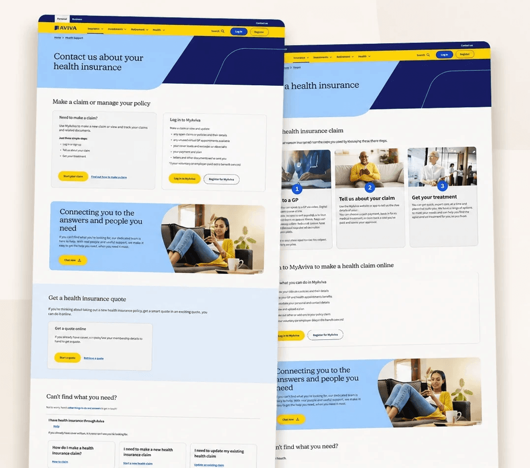
A 10-month cross-functional engagement to rethink the structure, content, and design of Aviva's digital support experience, reducing call centre demand and improving customer self-service.
Client
Aviva
My role
Project Lead
Type
Support Experience Design
Duration
10 months
Design Leadership
Content Strategy
Information Architecture
UX Strategy
Digital Transformation
SUMMARY
Introduction
The Challenge
The support content needed to serve customers across multiple business areas, each with different products, service journeys, operational priorities, and legacy content. Over time, this had produced a support experience that was fragmented and difficult to use.
The challenge was not simply to redesign a set of pages. It was to create a scalable support framework that could work across Aviva's business while remaining feasible within existing platform constraints.
Customers were often unable to find key information or complete support tasks without additional help. From a business perspective, this increased pressure on call center teams and contributed to avoidable operational cost.
My role
I was Project Lead, responsible for leading the engagement from discovery through design and implementation. I set the direction for the team, structured the discovery approach, led stakeholder engagement, authored proposals, ran kick-off workshops, and presented findings and recommendations to senior stakeholders.
I also built the team: interviewing members, identifying capability gaps, mentoring junior colleagues, and making sure the right mix of design, content, analysis, and delivery expertise was in place throughout.
I was the primary point of contact for senior stakeholders across product, design, AEM platform ownership, content, operations, and business units, leading regular updates, reviewing team outputs, and keeping the work aligned to both customer needs and business priorities.
Working within constraints
The project had several important constraints that shaped how we approached the work.
AEM Platform
The website ran on Adobe Experience Manager 6. Work had to be delivered within the existing component library, with limited scope for design system changes.
Navigation limits
The main navigation could only be modified within existing configuration options. Structural redesign was not possible.
Component mismatches
Some available AEM components did not align with desired design system patterns, requiring pragmatic design decisions throughout.
Budget limitations
Minimal design system changes were possible, which focused the team on information architecture, content, and template consistency instead.
Rather than treat these as blockers, I used the constraints to focus the team where we could have the greatest impact: information architecture, content clarity, page structure, template consistency, and task-oriented support journeys.
Discovery: Creating Evidence for Change
The first phase focused on building a clear evidence base. I led the team through a discovery process using a combination of methods: tree testing, competitor analysis, journey analysis, and usability analysis.
From Insights to Design Principles
The discovery findings were translated into a set of principles to guide the next phase.
1
Easier to navigate - clearer information architecture and consistent structure across business areas
2
Task-focused - support pages designed to help customers complete specific tasks, not browse general information
3
Content simplified - outdated information removed, remaining content made more concise and actionable
4
Distinct from marketing - support pages feel separate from broader product and marketing content
5
Scalable and maintainable - a framework that business units could sustain over time without creating inconsistency
Creating a Scalable Support Framework
Aligning Across Business Units
Impact
The work improved the discovery, navigation, and consistency of Aviva's support content, helping customers find key information more easily and creating a stronger foundation for digital self-service.
Full redesign delivered across all product lines
Led the redesign of support content across every product line, turning discovery findings into one consistent, task-focused framework.
First phase launched
The first tranche, Investing and Retirement, launched before my handover, with the remaining tranches approved and scheduled for rollout.
A scalable, maintainable framework
New templates and a validated information architecture gave Aviva a model it could sustain and extend, not a one-off set of pages.
Evidence-led change
Discovery moved stakeholders from subjective preferences to shared, evidence-based decisions, and secured approval for delivery and rollout.
Measurement built in from the start
I had the team brief Aviva's data science function to baseline call center demand and self-service traffic before launch, so impact could be tracked, not assumed.
Encouraging early signals
Before handover, the product owner reported early positive movement on those measures. I'm careful not to over-attribute, but the signals pointed where the design intended.
Reflection
My contribution
Project leadership
Discovery
Stakeholder alignment
IA & content strategy
Team building
Senior reporting
Collaborators
Design & Content Team
UX design, content writing & IA
AEM Platform Team
Technical feasibility & component delivery
Client Business Units
Requirements, content sign-off & go-live
Website Product Owners
Design approvals & content production
Methods Used
Tree testing
Competitor analysis
Journey analysis
Usability analysis
Requirements workshops
Content strategy
IA design
Usability testing
Stakeholder presentations
Next case study
Oscar Choi
© 2026 · Irvine, California